At Opti Digital, we offer technologies that allow publishers to optimize their monetization while protecting their UX as much as possible.
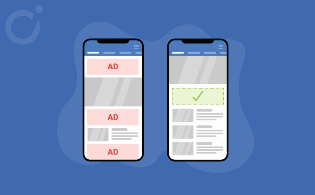
Content jumps, intrusive ads, slow site loading… Poor ad layouts cause a number of annoyances that can negatively impact your user experience and your overall advertising performance. That’s why we recommend taking care of the ad structure, including the volume (ad pressure) and location of your ads.
In our last webinar, we shared our top tips for optimal ad layouts. Discover them all now.
The 5 steps to master your Ad Layout
Tip 1 – Placements: Dos and don’ts
Your strategy about placements depends on the type of auction you run on your site. Here we will focus on the right placement strategy for open auctions that are paid on a CPM basis.
Mobile #1: It is important to avoid having non-sticky ads at the top of the screen on mobile. Indeed, users tend to scroll fast, until they reach the content, which will reduce your viewability rate considerably. Equally, it is very unlikely that a visitor will scroll to the bottom of your site, therefore, you should avoid placing a non-sticky ad just above the footer.
Mobile #2: We very often favor integration in the heart of the content, since this is where the user’s attention is focused.
Read more: Why should ad placements be important in your monetization strategy?
Mobile #3: As for the insertion in the heart of content, placing an ad at the end of an article can generate a good click rate.
Mobile #4: Used in the right way, interstitial ads offer unbeatable CTRs and high eCPMs. However, as it is an intrusive format it is essential to use the frequency capping set by google (1 interstitial per hour for 1 for a unique user) in order to protect your UX. The closing button must also be large enough to allow the user to shut the ad easily.
Tip 2 – Customize your page templates
The worst mistake a publisher could make in terms of layout is to have a single template for an entire site. It is recommended to adapt your ad structure to improve your monetization performance by customizing your layout:
- By page – Prepare a specific layout for each page category whether it’s the home page, an article page or even a product page as the browsing behavior will be different.
- By device – On mobile, an ad placed right at the fold, after the first paragraph, is a good option as this is where viewability and click-through rates are the best. On the other hand, on a desktop, a billboard type position (above the picture) will be more suitable.
- By user – Don’t treat your users the same way and reward their loyalty! At Opti Digital, we adapt the advertising pressure to the type of user. For example, if the user is registered, we will show him/her fewer ads.
Tip 3 – Distribute your ads correctly
Ideally, we recommend that all publishers use technology that can distribute ads harmoniously within the content and around other site elements.
This type of technology should be set up in order to :
- Define a distance, in pixels, between the ads, the images, the text…
- Adapt the number of ads according to the length of your articles. The longer the article, the more ads will be displayed.
You wish to discover the two following steps to improve your layout?
Fill out the form below and get exclusive access to the webinar replay and presentation slides.
To go further on the subject, do not hesitate to contact us.


